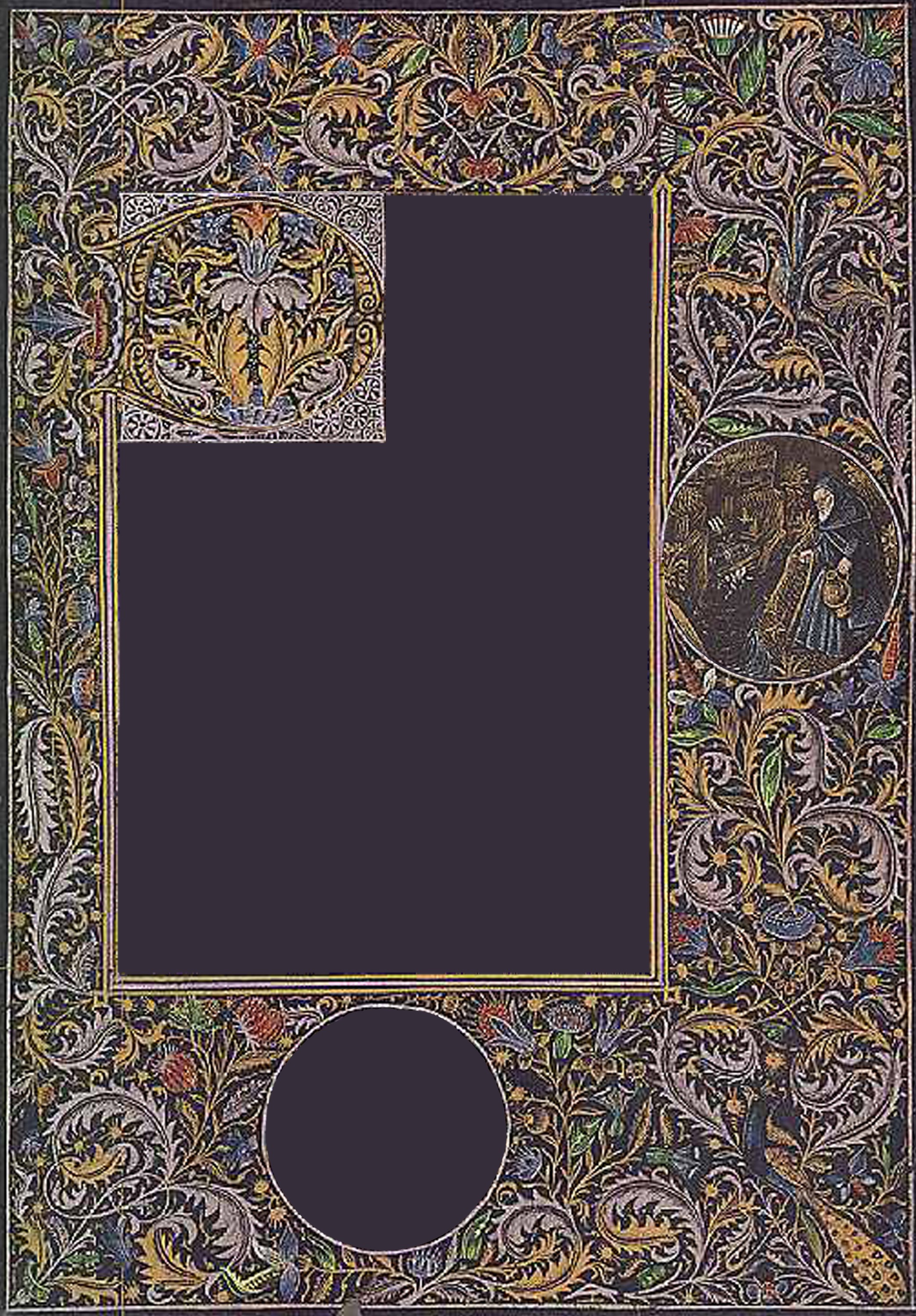
I’ve been talking about wanting to try black hours from the first QPT where I entered illumination. Although I’m starting to prep for A&S next year, I thought it was about time I did what I said I wanted to do. I decided to take my inspiration and designs from the Libro Negro de las Horas de Galeazzo, or Das Schwarze Gebetbuch. This book of hours drew my attention because it not only has gold and silver, but other colours as well. I also love that each page is unique; the flowers, fruits, animals, and versals are different on every page. Unfortunately, the majority of the book is not available in good quality online, only two pages of it, and OF COURSE I wouldn’t choose those pages for my design, so I’m working from really pixelated pictures. Some I have struggled to figure out what was meant to be drawn. Add missing chunks of paint (presumably because the original was painted thickly to allow the colour to show brightly), and it’s a perilous “translation.” Not to mention that details and shading are actually done differently on different pages of the manuscript. It’s like a group of people decided to use ascanthus leaves and a basic colour and layout scheme, and each painted their own pages. The green leaves on the page I chose had no ressemblance to the green leaves on the page I found with better graphics. Of course. As usual, I took elements from a number of pages in the manuscript and fitted them together. The border image, versal border, versal center, and featured picture are all from different pages of the book.
Information on where to find:
Das schwarze gebetbuch, codex 1856 in the austrian national library, 1444-1476, language: german; The black prayer book : ( prayer book of Galeazzo Maria Sforza) http://data.onb.ac.at/rec/AC01878939
My mock-up:

The original was done on black-dyed parchment (dyed with gill, a parasitic larva oak shell), with gold and silver ink, not oxidized. There also appears to be a few white flowers, but ascanthus leaves and blue flowers appear to be done in silver. The text is said to be in silver and looks identical to the ascanthus leaves, so they must be in silver as well. Upon further inspection, I decided that all of the white was actually silver. Commentary says that the manuscript is remarkably untarnished and is now stored between plexiglass sheets to maintain its colour integrity. I used black paper provided to me by the wonderful THL Liadin Chu. Pergamenta is very difficult to dye, and the dye used historically is corrosive, so historical accuracy isn’t ideal for longevity here. I am appearing to have no bleeding issues, unlike a friend who had a hard time with painting white on black for a scroll. Perhaps this is because I’m not using white, perhaps it is because of my paint consistency and how thickly or thinly I lay it on, perhaps it is because I use only gouache and no watercolour, and perhaps this is due to the type of paper being used. I haven’t had to seal it at all.
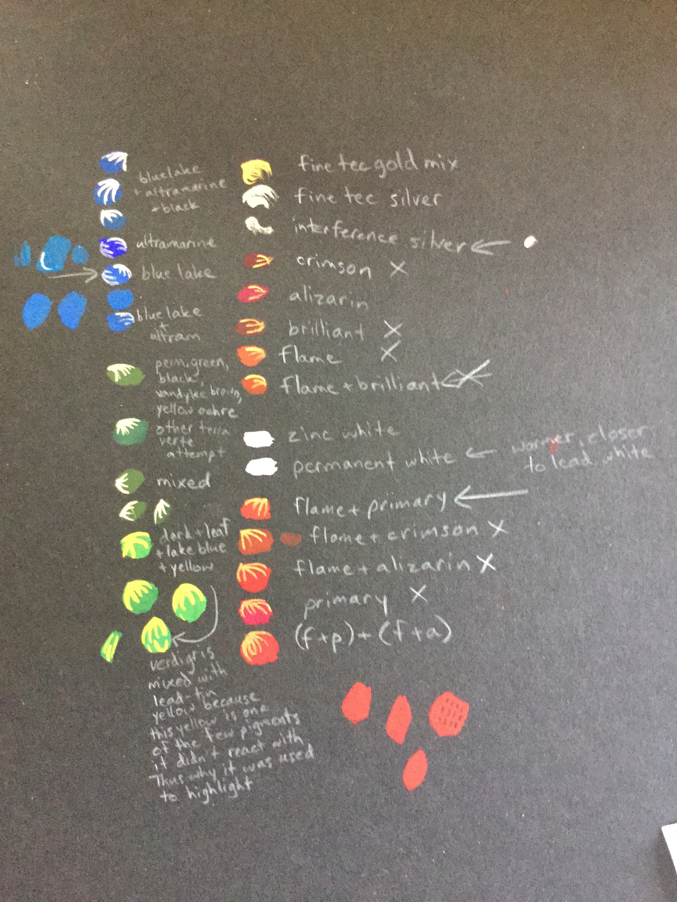
I fought with the green for a while, experimenting with extant greens I could find like malachite, terra verte and verdigris. None seemed quite right. I finally found a paper on pigment chemistry that said that lead tin yellow was not reactive with verdigris, which is reactive with most other pigments. As a result, I tried mixing a lead-tin yellow shade with a verdigris shade, and was able to achieve a colour very similar to what I can see on the manuscript. I also know that this is why yellow was used as a highlight on this green rather than white, which reacted with the verdigris. The paper listed two kinds of lead tin yellow, one which was nonreactive with verdigris and one that was. Luckily, the reactive one wasn’t used until after 1600, meaning that the first one was used. Thinking back to celtic works I saw in a paper about the fading of colours, it noted that the yellow, though it appears very soft now, was actually originally a very vibrant, bright yellow. I have to assume that they’re talking about the same lead-tin yellow as is used in this manuscript due to the similar colours, so the yellow must have faded over time. They certainly couldn’t have mixed it with white without it reacting with the verdigris. Therefore I will use a bright yellow to highlight rather than a pale, pastel yellow. I added a tiny bit of orangey red in to make the yellow a little closer to the lead tin yellow colour.
It appears silver was used to highlight blues and gold used to highlight reds, which would make sense stylistically. I like that there are few colours in this compared to the number of colours, shades, and faces in my last project. I fought with finding the right red for a while. None of the Windsor and Newton reds I have (Primary, Flame, Alizarin) are actually red, and the Reeves reds I have aren’t much better. I finally decided on a combination of two parts flame red to one part primary red and one part alizarin crimson. In period they probably used minium, but I have no intention of using overtly toxic pigments. Although Fine Tec silver looks more silver, I think that the Daniel Smith Interference Silver watercolour gives a closer look to what might appear white in a photograph. I have tested two whites, permanent (titanium) white and zinc white, on the paper (labelling the more stark and cool one as warmer), but I didn’t use white in the end.
 I started out trying to use a camera lucida to trace this project, with a white watercolour pencil. I quickly decided that wasn’t the way to go. Even when I finally got the size and proportions mostly right, there was just too much variance between the top and bottom of the image for the motifs to fit properly within the border while looking through the camera at the dual image. I had no white “carbon” paper, so I needed a different solution. I decided to use the borders I had already drawn in white pencil to line up the border pieces printed out, and trace them with graphite paper. Although the image is faint by comparison with a white tracing, I think I like it. It gives me the outline I need while not leaving any white dust on the paper, and if I make a mistake in the painting at all, the graphite will not highlight my mistake. In fact, it will just be slightly darker there than it was before. To clean markings off of the paper when necessary, I am using a kneaded grey eraser. It will not leave any white marks on the paper. Nonetheless, I have ended up with a lot of little white specks. I hope the paint hides most of them, because I can’t figure out how to remove them otherwise. The entire motif is about 8 1/2″ by 12″.
 My traced image, just started. See the graphite paper lines?
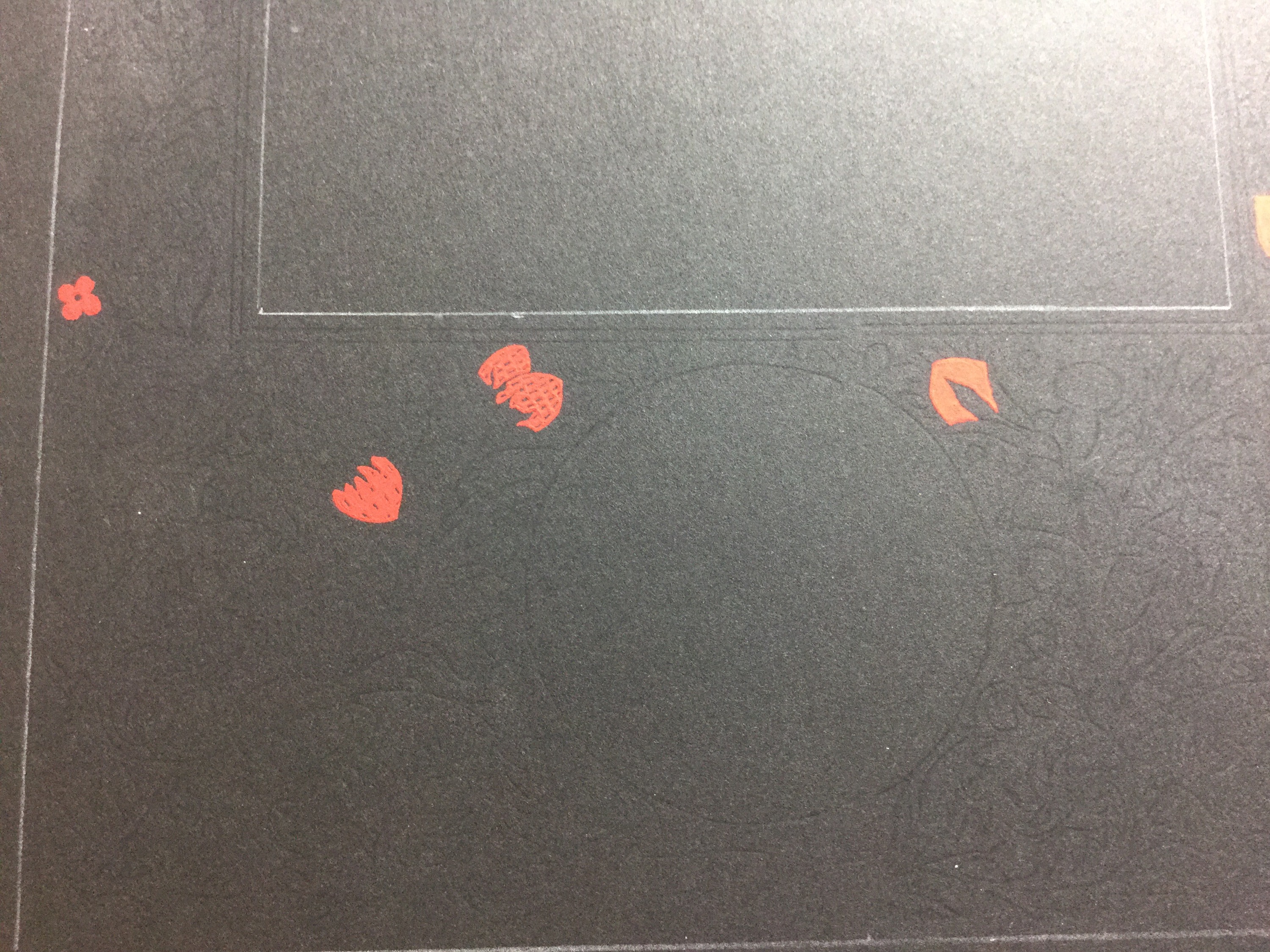
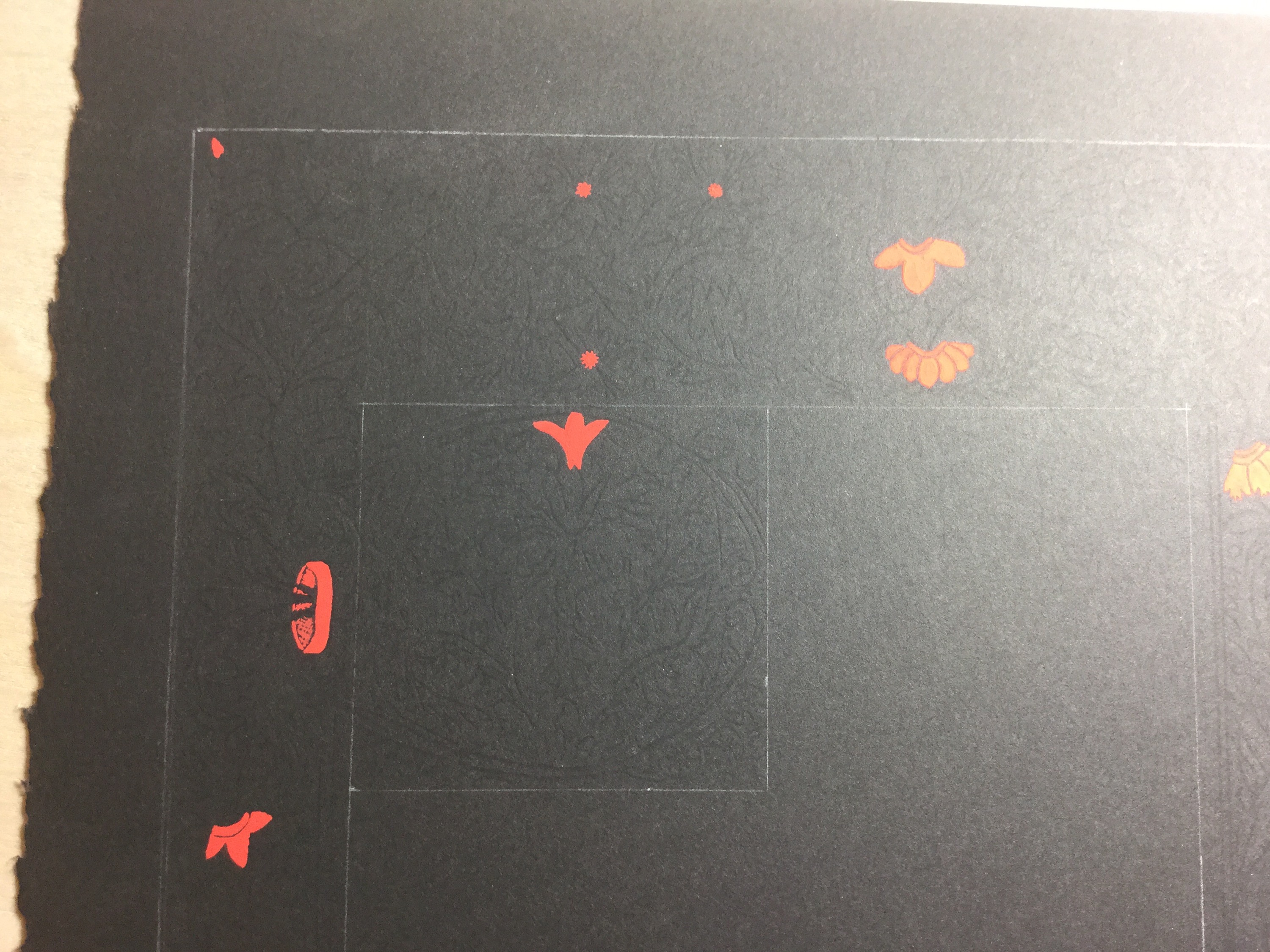
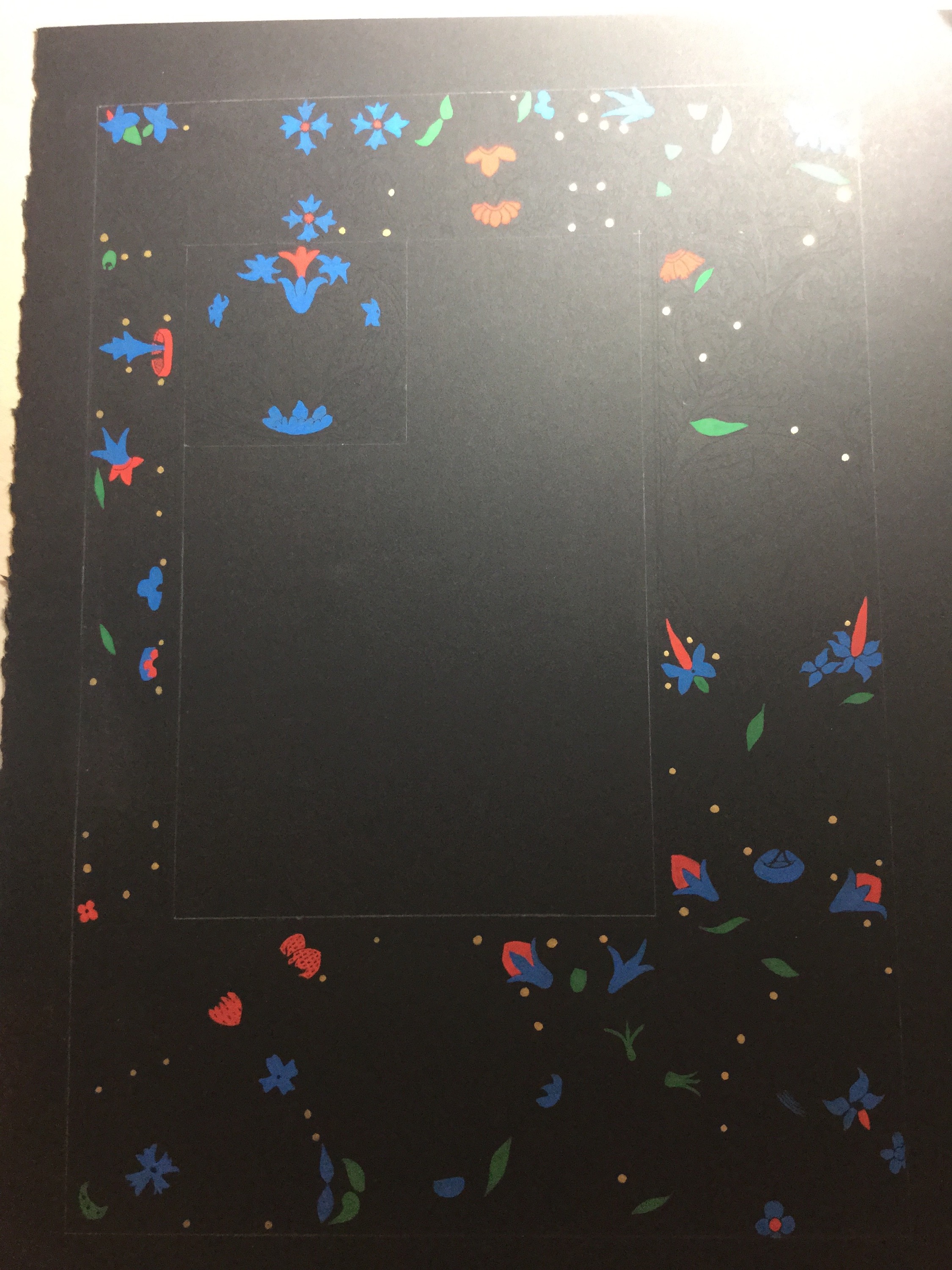
I found that the graphite paper lines weren’t really enough on their own, so I referred back constantly to my printout and the image on my iPad. I found most of the black within the colour was chipped paint, not shading, so I painted most of the colours solidly. The one notable exception was the strawberries.
I started by painting all of the colours. A friend said it looked kind of like an old video game.
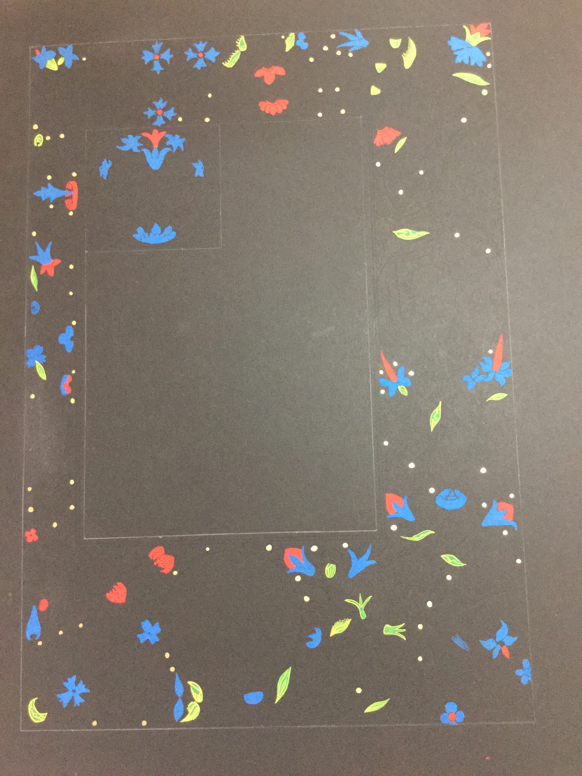
 I painted the top half of that oval-shaped round thing solid and the bottom hatched. I’ll sort it out when I do the highlighting with gold.

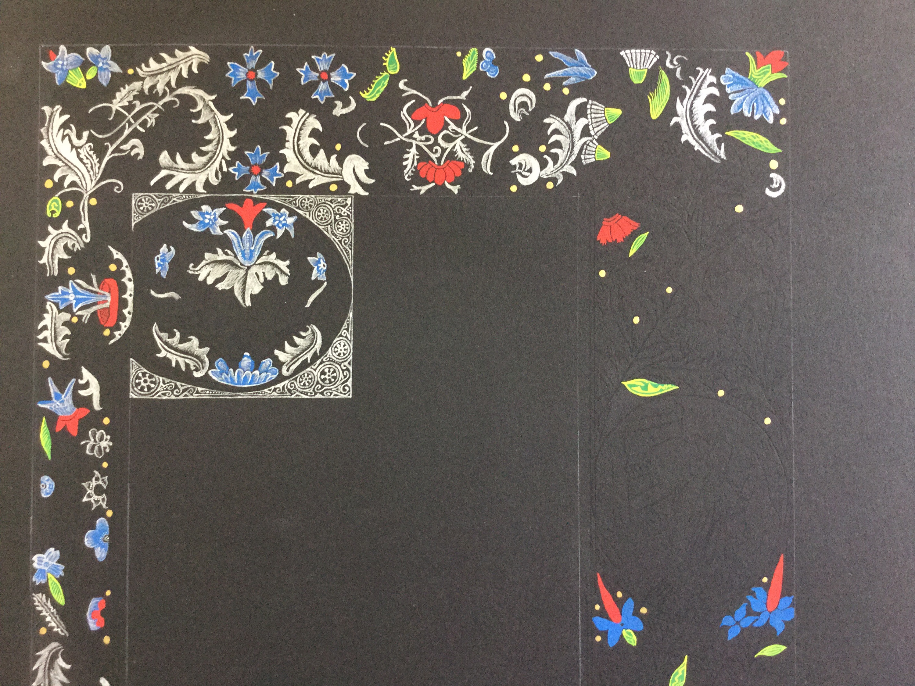
 I’m not entirely happy with some of the highlighting on the green, although it is relatively true to the original design in most places. I will be repainting some green in the future and then redoing the yellow highlight. The beauty of gouache! I also made a point of never allowing the green to touch the other paint colours (other than yellow), as would be in keeping with verdigris’s use in period (even though I didn’t use real verdigris). With really close inspection of originals, it looks like this was done on the extant ones, which lends credence to my theory of a verdigris and lead tin yellow blend being used for the green.
There are some parts of the original I haven’t figured out yet, most notably the greenish thing near the inner border just inside the strawberry area. I left it alone and will figure it out later.
Next I started the silver. At 21 hours of just painting silver, I am about halfway done. Whew! The limited colour palette of this project was a welcome relief after the last, but the amount of silver and gold is staggering, and will take a long time to finish. I am pleased to find that the silver is looking very similar to the silver areas in the original, which justifies its use over white. I’m not completely happy with the silver highlights on a few of the flowers, so I’ll be going back to repaint them blue and trying the highlighting again, once the main bodies of gold and silver are done. I also drew the line around the versal a tad long. A tiny drop of black paint may fix that, though it might not matter in the end. The bottom circle has been left blank for the Ealdormere crown seal, and it’s outline ended up a tiny bit wavy to go around the leaf that got too close.
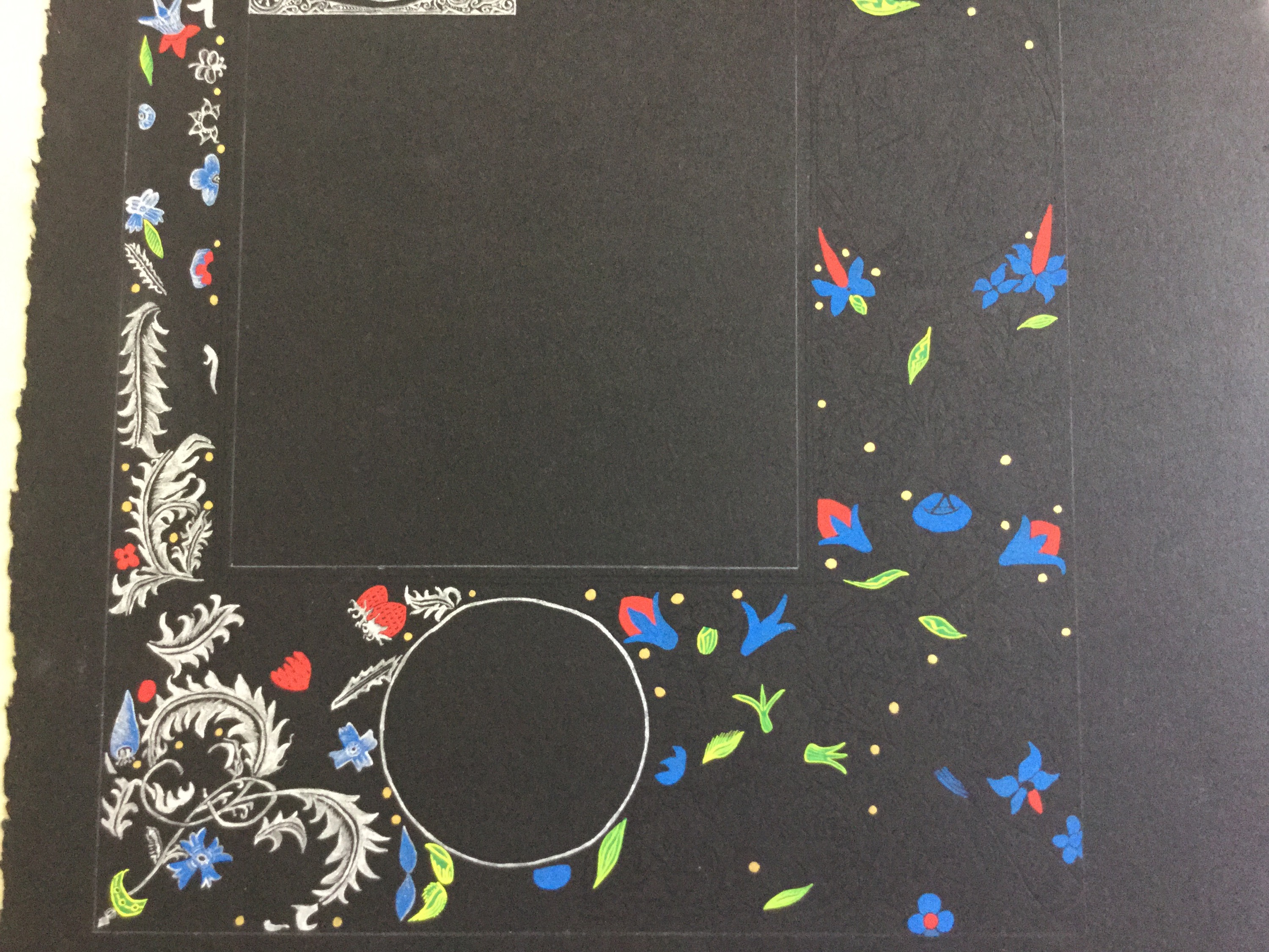 Though I mean to put a picture in the circle on the side (as well as the missing animals), I am going to wait until the surrounding areas are filled in more so that I can see where everything goes better. The animals are impossible at this stage of the project (a downside of the graphite lines, and the reason why I put some gold dots in early), and the great thing about the graphite lines is that if I decide later that I want to change the picture on the side, I probably can, though I will have to paint it without guide lines, which is a huge challenge. Minor adjustments don’t show up much when your lines are black. I may use the same picture but change it a little so that it can include the badge of whatever award this ends up being for.
I’ll update when I have more to share!