I was approached in spring 2015 for a special project, due at Murder Melee. The Barony of Ben Dunfirth wanted to award a barony member with the highest honour available to them – the Golden Boar. The person who approached me thought that I was a part of that person’s household, and although I’m not, I said I’d have a go at it.
With an Italian-esque persona and my desire to try different gold effects for my seventh scroll, the choice of project was a no-brainer. I made a few major design changes – adding a golden boar from another manuscript to the top window, changing the left window to a shaded gold rose, setting a woman with golden hair into the right window, and (most awkwardly) creating a shield-shaped window for the seal at the bottom, framing it with ribbons from elsewhere in the page to help the oversized shield shape fit into the space better. I also changed the versal design completely, using one from a different manuscript, and added a Rozakii symbol to the versal. I had never previously used gold in any of the ways I was going to use it here, so every gold experience was a new one (the only exception might be the boar’s golden hairs).
I originally started out thinking I may be able to indent the paper with a sharp, hard pencil. The lines ended up way too wide, though it the recipient turns their award paper over they will see my attempt firmly and permanently etched on the back side. I don’t have any photos of the tracing, but I used graphite paper to trace. I then proceeded to start painting.
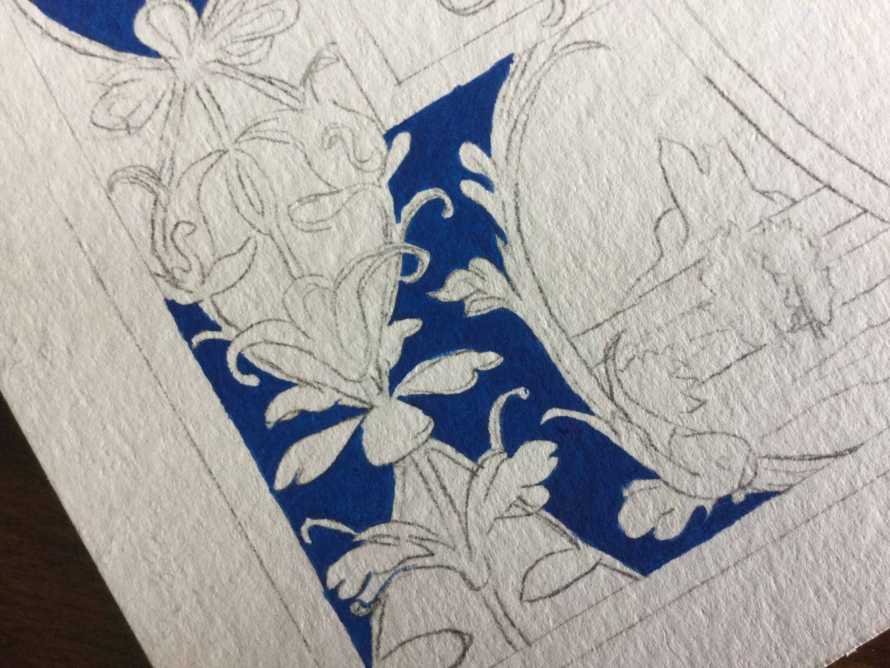
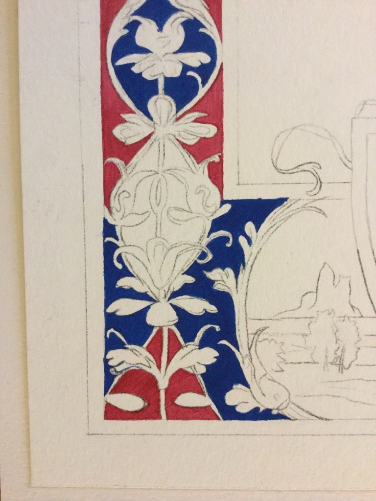
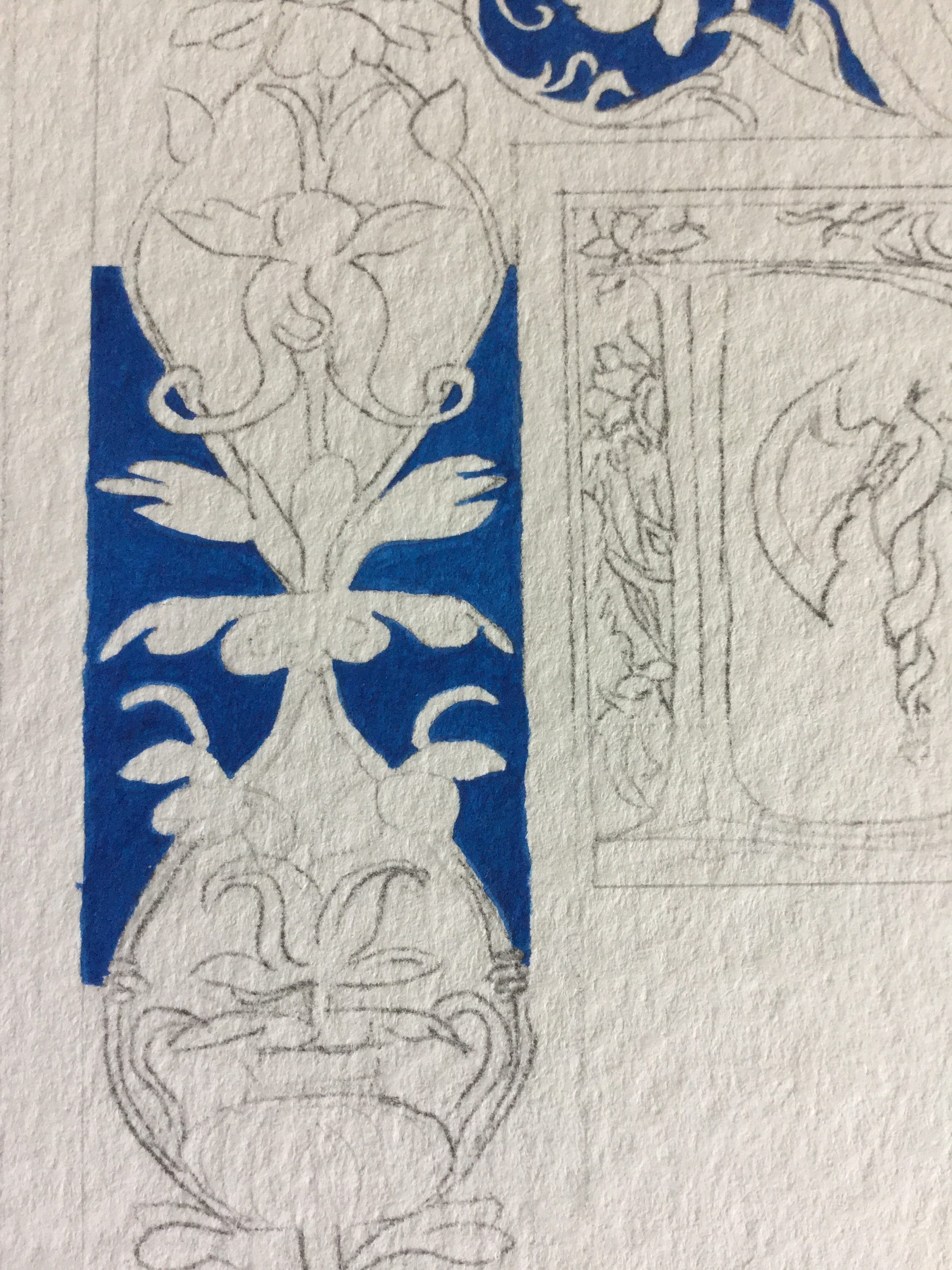 As you can see, I began with blue, and its opacity and evenness was NOT to my liking. I ended up painting every blue section three times until I was satisfied. Likewise, the reds ended up being painted 2-3 times, and the greens were also painted twice. The result was a beautiful, velvety-looking finish. People who saw it commented on how nice and how unusual that was, but from my research, that’s what gouache is meant to look like. As you can see, I chose a brighter blue, a deep but still bright red, and a malachite green colour, which was fun to try to mix.
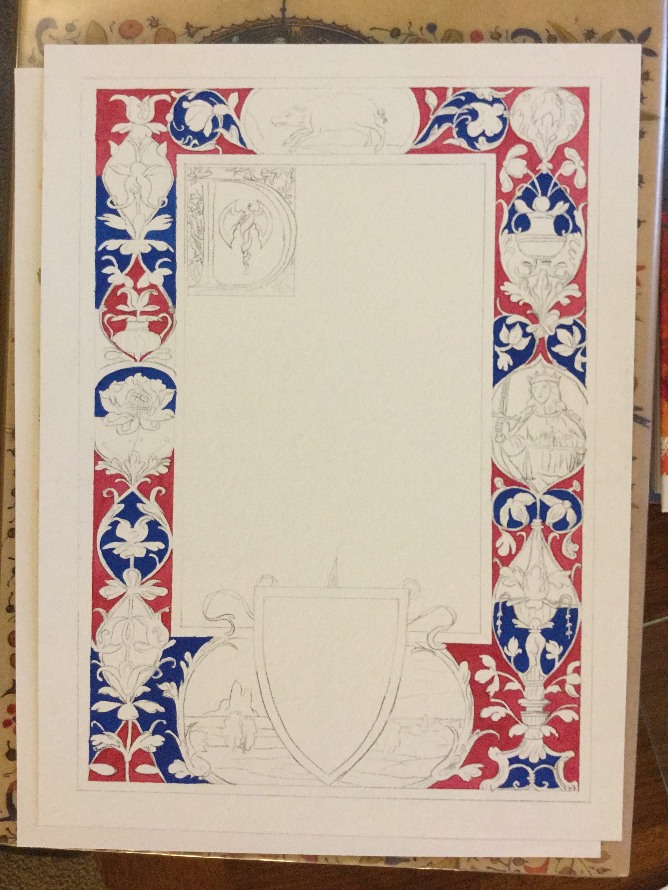 You can see here where I started to put a second coat of the red on. It still wasn’t enough.
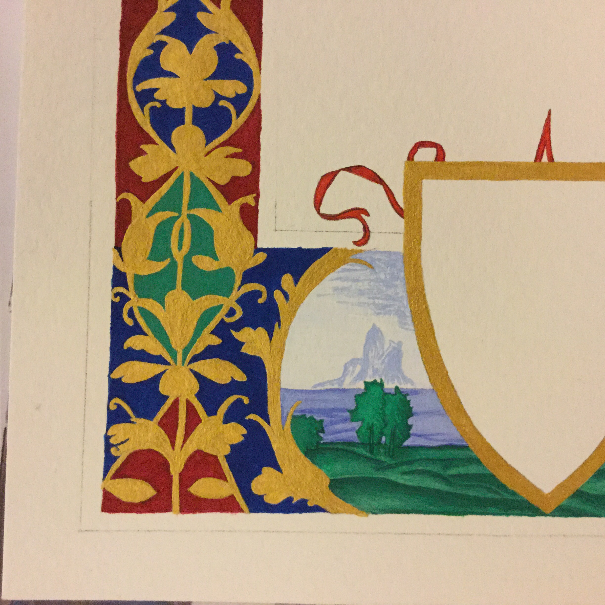
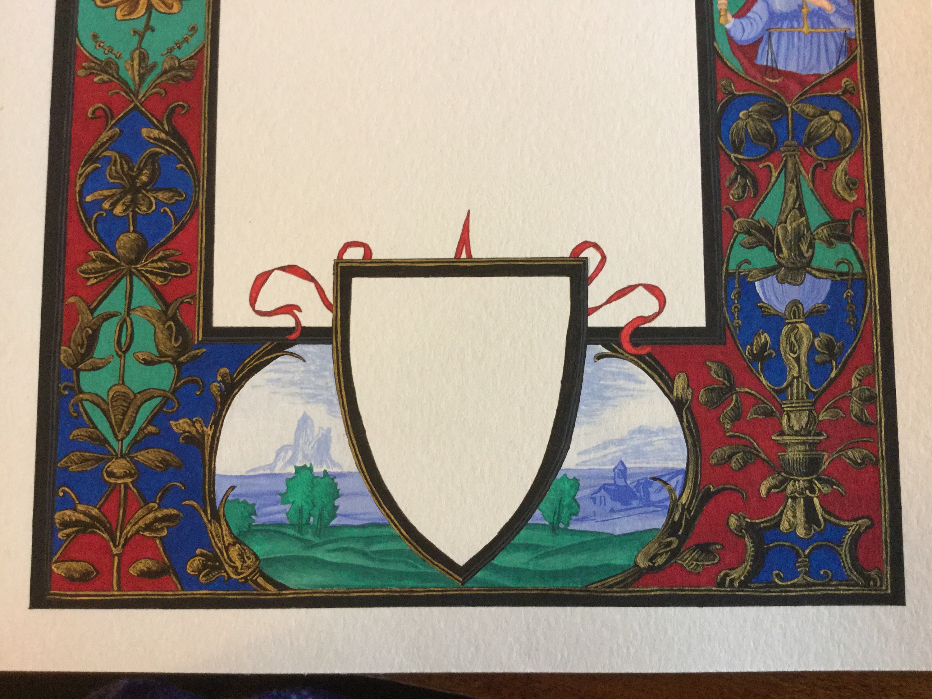
 After the flat background areas were painted, I started on the background/window scenes. The bottom window contained rolling, green hills, and an illusory town and island. For the hills, I used a base of green first, then darkened some of the green with either a darker green or black (I can’t remember anymore). I painted the darrk shades near the tops of the hills to define them, as light hits just in front of the hill and makes a dark back edge. I added some white to the base of the hills to contrast with the dark top edges, and then thoroughly blended the dark and light tones to make a smoother gradient.
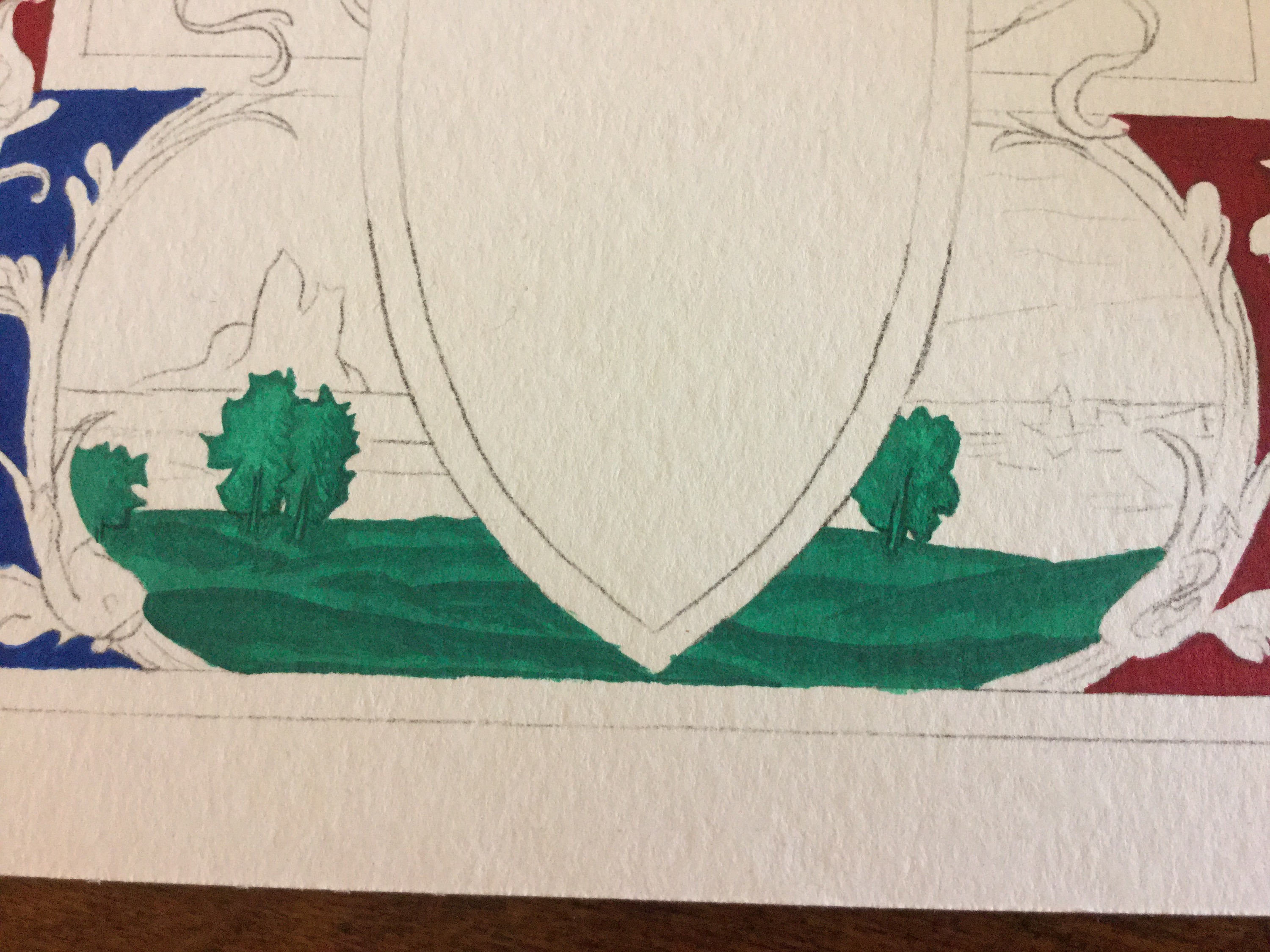
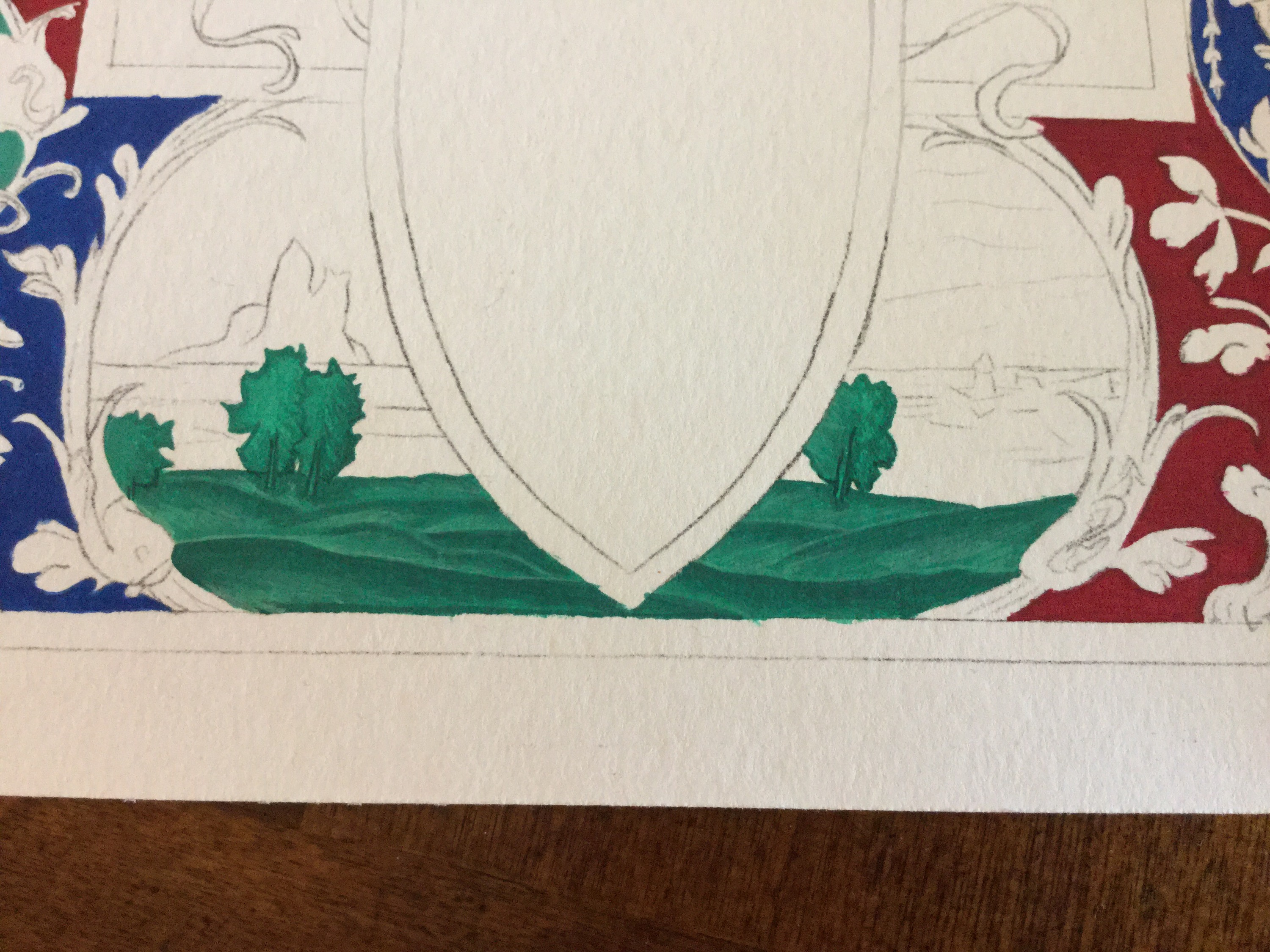 For the sky and sea, I used about 3-4 shades of blue, with varying levels of white. The sea was painted a mid light blue, followed by dark lines, and then very light white highlights. It was tricky to portray the waved properly, so I spent a lot of time moving dark and light lines around with a wet paintbrush, blending and differentiating.
The town, being painted on the sea, had the same base as the sea, but I used a different blue to create the outlines of the hill and building. For the other cliffs and hills on the sky, I first painted the sky my very lightest shade of blue, which appeared completely white on my palette. Believe it or not, the shade I used on top of that also looked pretty much white on my palette, though it’s obviously far from that here.
I used the same blue shades to create the shading of the various flowers and vessels around the border, the dress of the woman, and to create the sky behind the boar.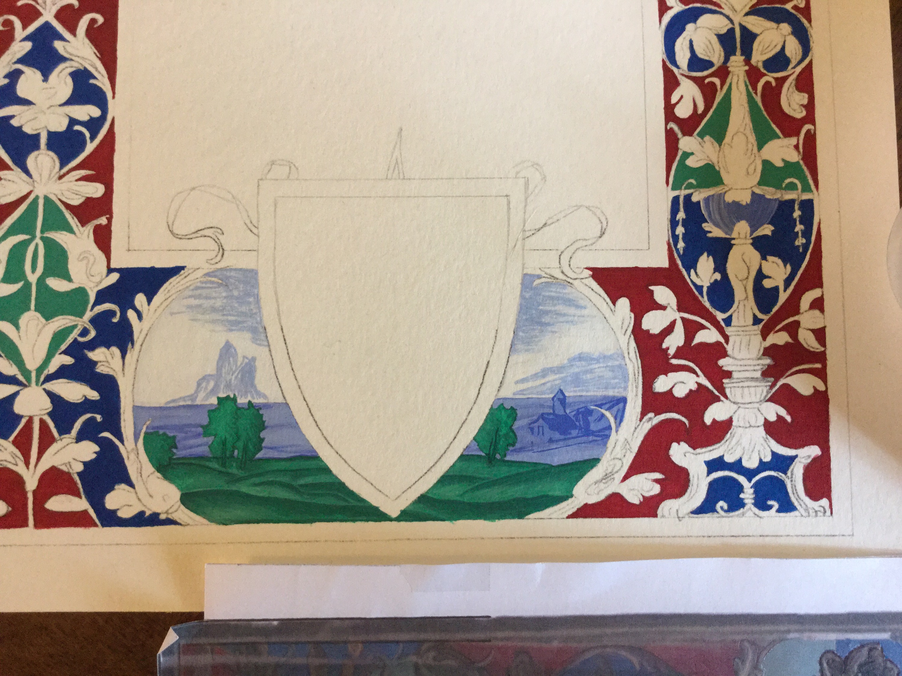
 Next, I took a shot at two things – the woman’s hair, and the gold base. I failed horribly on the hair and had to wet it and dab most of it back up, but that did leave a nice, darker border around the edges of her hair. I probably removed most of the paint 5-6 times in the course of trying to get it right, burnishing with a stone once or twice when the paper fibre really started to come up and cause problems.
The ribbon around the shield was easy, with a nice, bright red, and green-darkened outlines and folds. The boar’s dirt was done similarly to the green hills at the bottom.
The other big mistake here was painting gold first. I had thought that the base was gold and black was used for shading, but when I tried to put this theory into practice, it came out all wrong. I did not look right at all. Speaking with Master Piero, he pointed out that black was the base and gold was used as a highlight instead of the other way around. Thus began the arduous process of trying to paint black over gold. Hint – it doesn’t paint over easily. Three coats of black later, and I was back in business.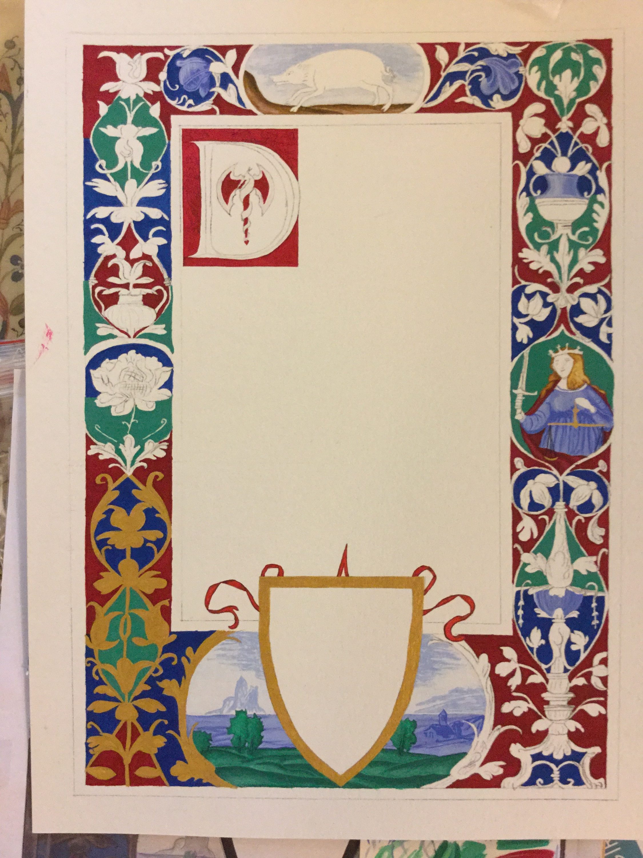
 Trying to paint over the gold with black. You can see the three coat black at the bottom corner, then two coat black at the top of the border around the bottom scene, and the one coat black everywhere else.
 I finally began to create the vines, leaves, and flowers. The process went more smoothly than I thought it would. I did try to fix some of the original artist’s lighting inconsistencies. I found quite quickly that a light edge on the dark side of a piece will help to define the invisible edge.
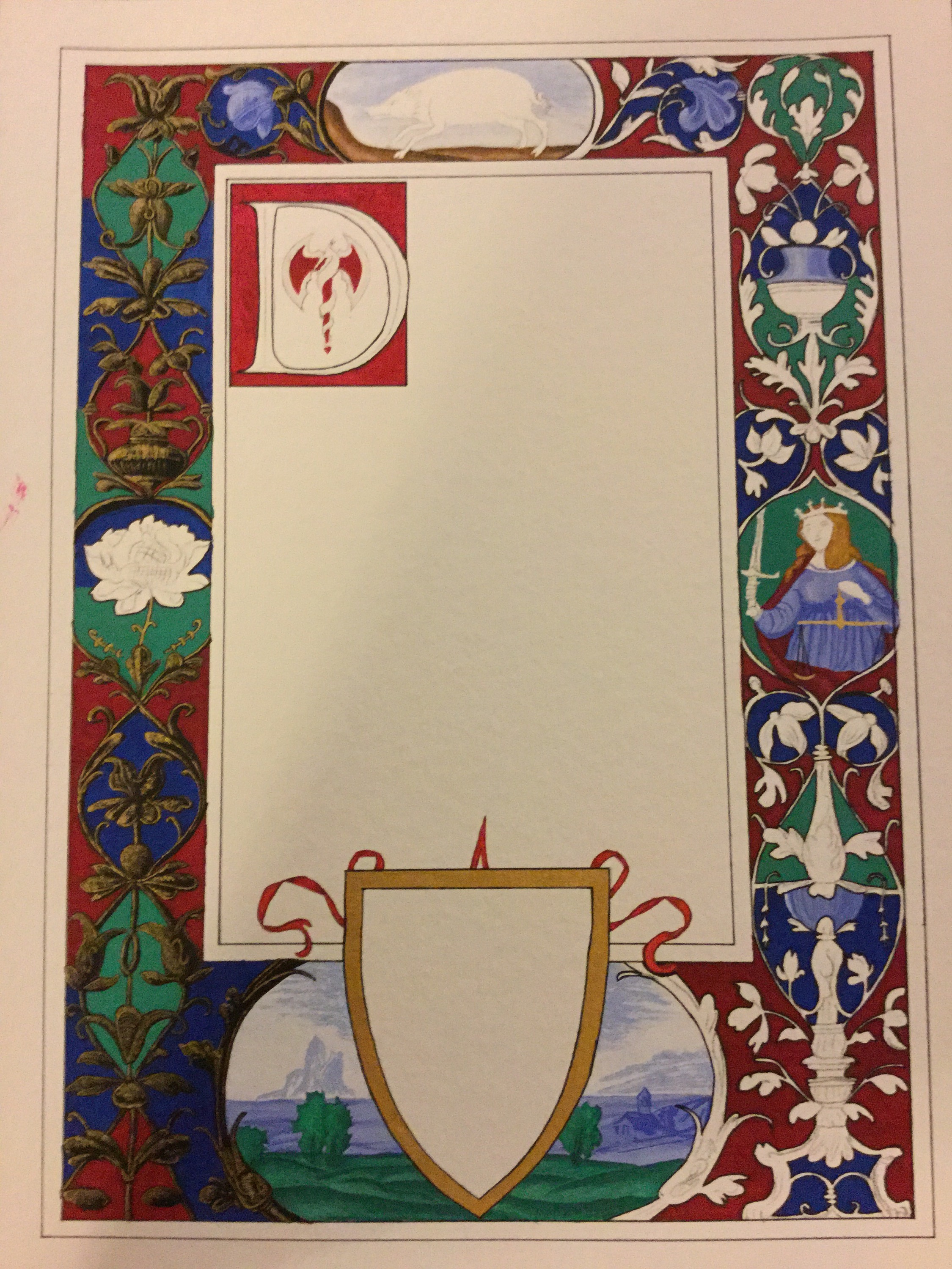 I began to work on the versal. There were a few traced reference lines showing through the red, but not much – I think I ended up creating a bunch of the design myself, using the same motif styles. I started by marking dark shadows and lines, then watered my green-darkened red down a little and painted the softer shadows. Finally, I created the gold highlights to finish bringing out the design. The red of the Rozakii took a lot of coats to be solidly red.
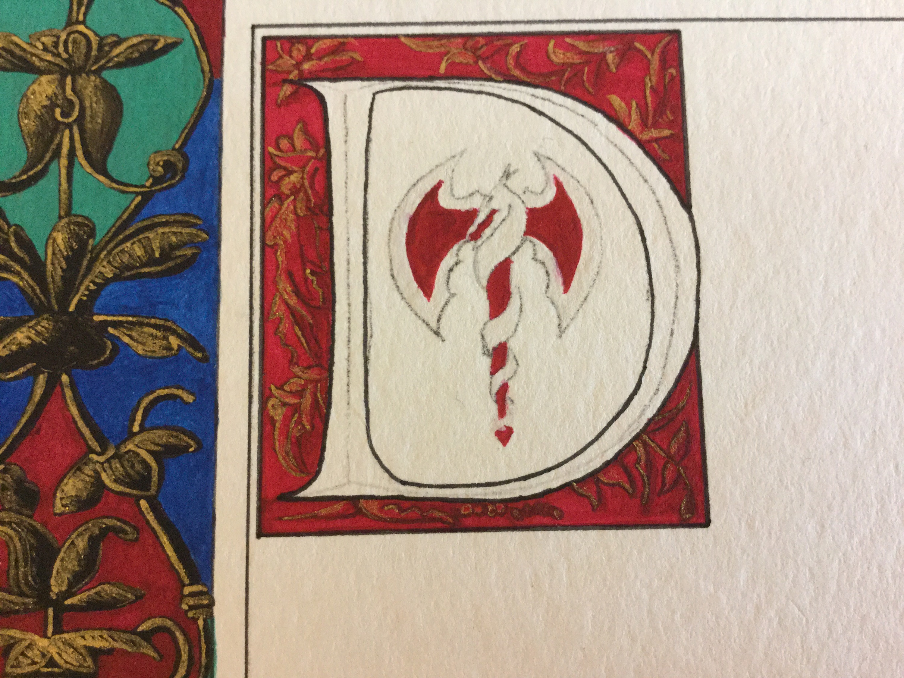 Darkening the second side in preparation for gold. Boar now has browns, painted in much the same way as the ground beneath its feet. The woman’s hair is also finally looking more correct.
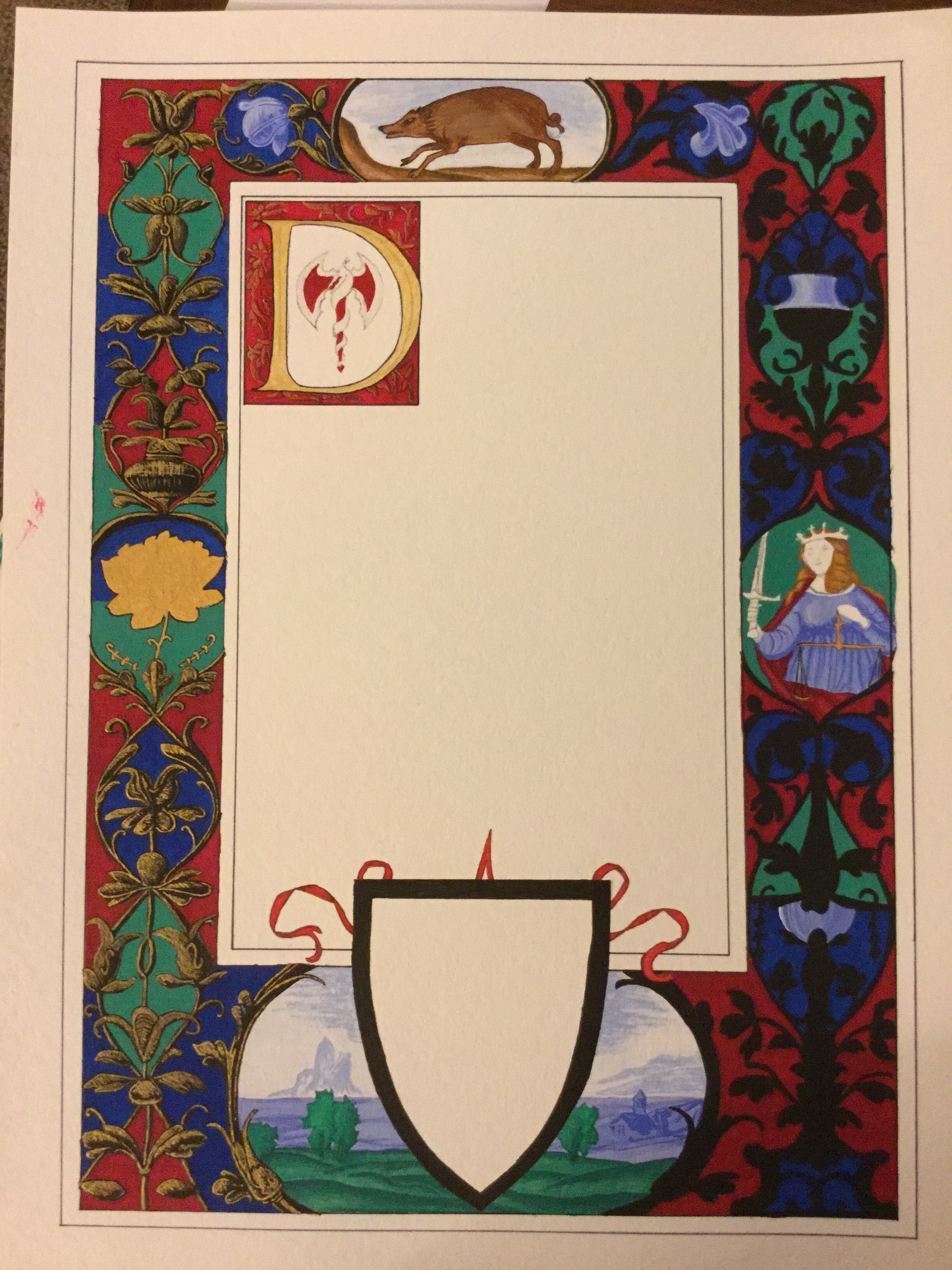 Adding subtle, coarse, golden hairs and golden hoofs and highlights to the boar to make it a “golden boar.”
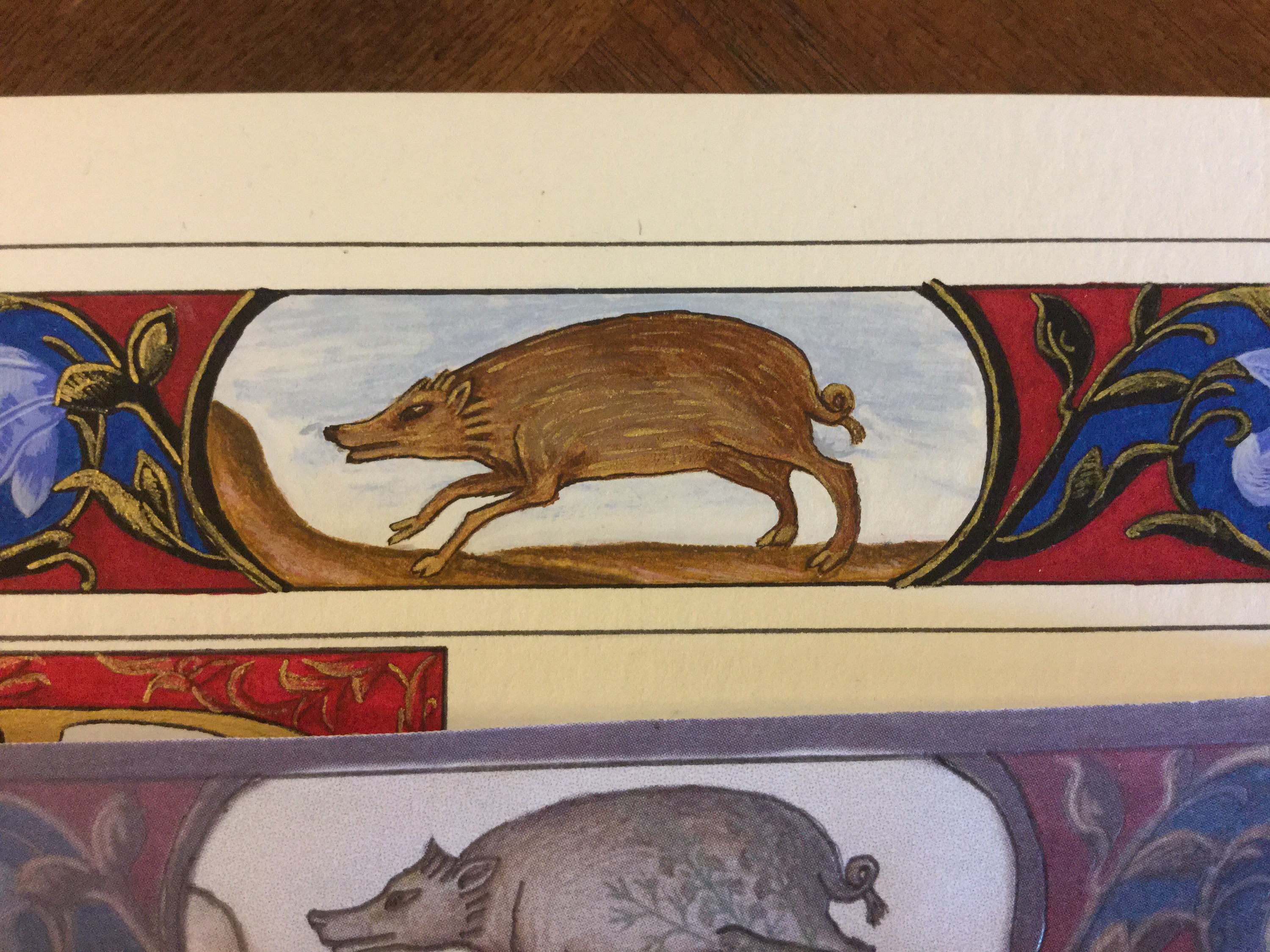 This was a fun part. I had to shade the rose and create its shapes by applying various levels of brown to the gold base. Every time I applied brown to the paper, I had tested it on a scrap first to make sure the paintbrush was loaded with the right ratio of brown pigment to water, which changed throughout the work. The subtle shift of dark lines and lighter angles in the cross-hatched center was intentional. It was meant to look the same as a scored loaf or cookie opens up when baked.
You can also see here a boo boo of red paint in the margin. Luckily that one was easy to scrape off with an exacto knife. I had put off deciding what to do with the area around the Rozakii, and now it was time to decide. I went with continuing the design from outside the letter D, which became tricky when I didn’t have any more of the original paint mix left.
Also here you can see a bit of how the black borders are dimensioned. The inner border has a bead on the outside, and the outer border has a bead on the inner portion. The gold highlights were easy, but I pondered the shadow for a while. To delineate the shadowed bead, I decided to use grey. You’ll be able to see it better in close-ups. It’s also around the shield frame at the bottom.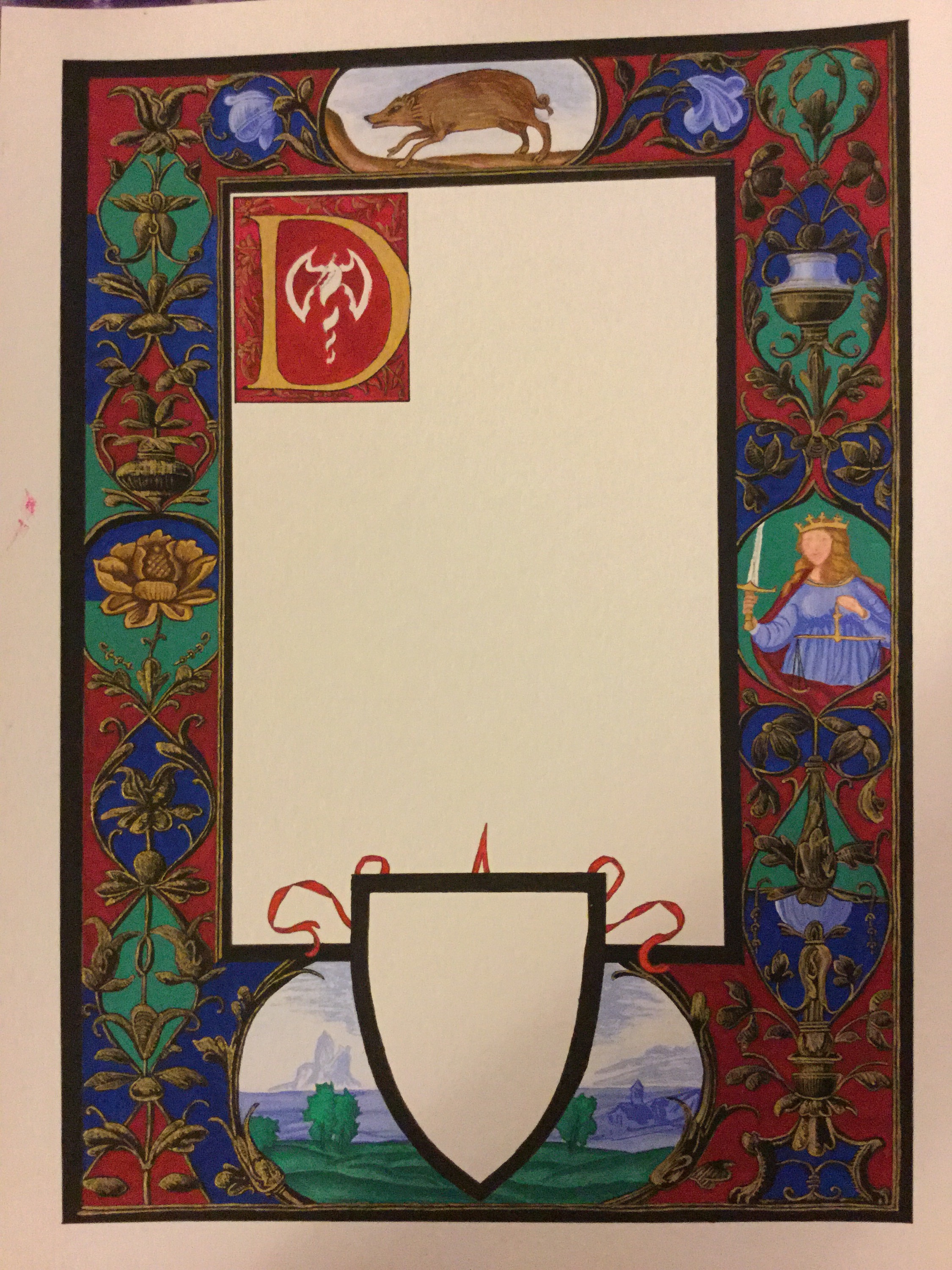
 I completed the inner D design the same way I did the design outside the D, and then created some black shadowing around the Rozakii and the D, to give it more dimension in preparation for shading the D.
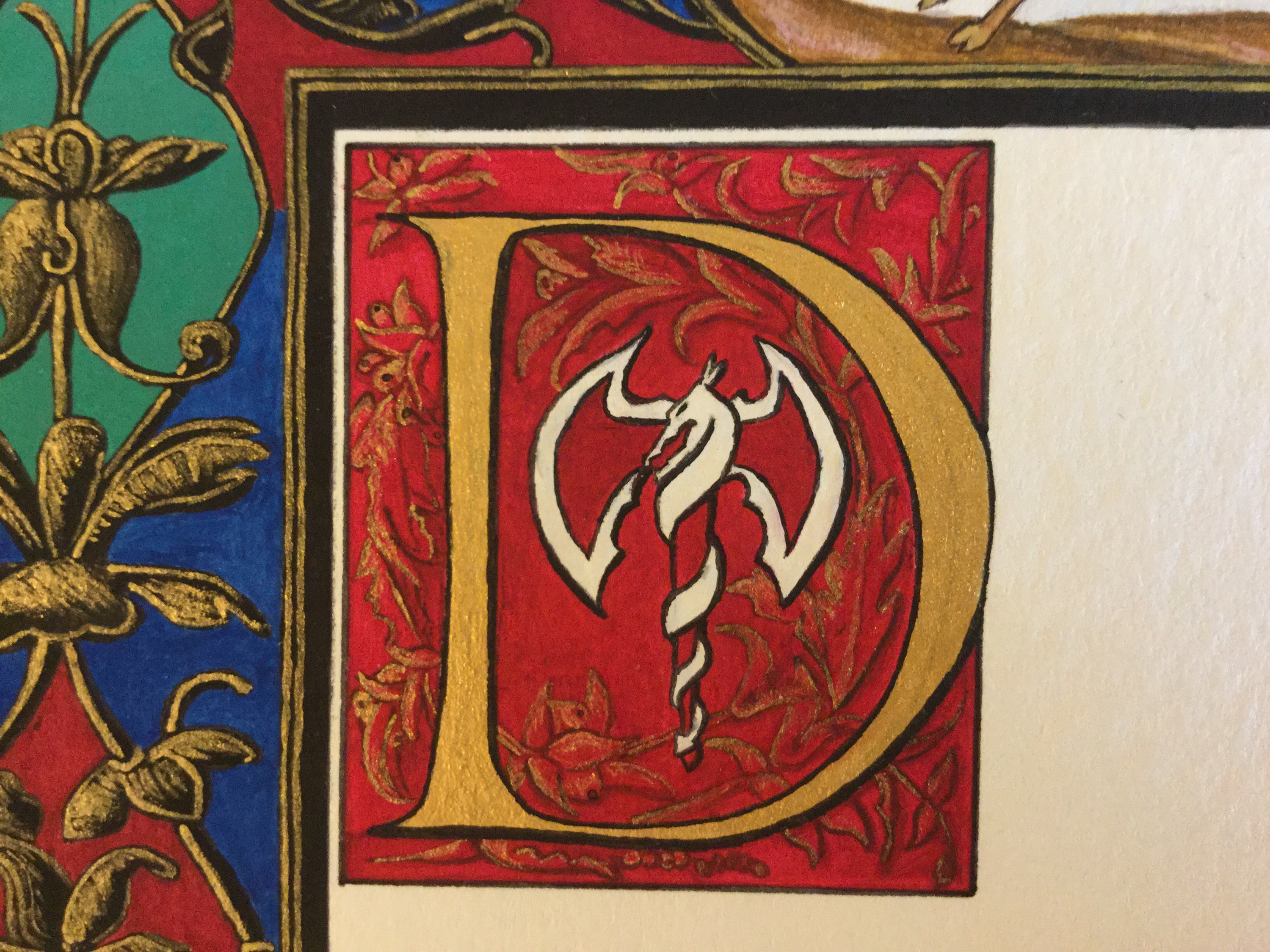 Shading the D. I again used my brown paints, very carefully, checking the strength of pigment in every single brush load. The shadowing changes around the bevel needed to be really subtle. I found the trickiest parts were the points at the top and bottom of the D upright. Luckily, once dry, a little bit of water on the brush removed small amounts of brown while leaving the gold intact.
 A close up of the completed, shaded D. I love this versal.
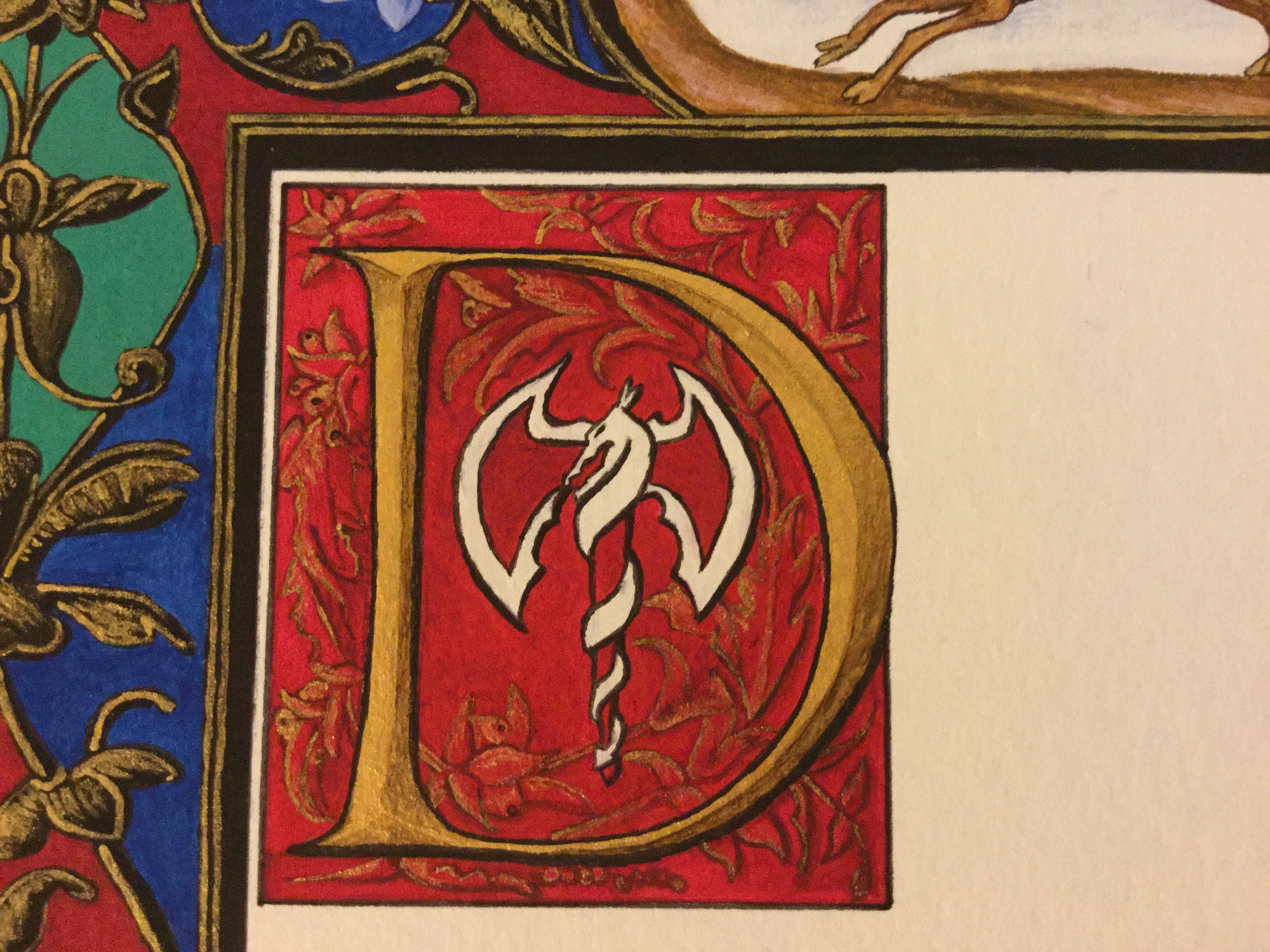 More close-ups:
 You can see the shading of the vase on the right hand side in this one, as well as the top blue flowers. The flowers are shaded with fine hatching, and turned out beautifully. The vase shading turned out equally well, but it was the gold at the bottom that most intrigued me. It’s always so nerve-wracking trying to combine shadowing and patterns, but I think it worked really well here.
You can also just barely see the shading on the gold crown and sword hilt for Lady Justice there. After the rose and D, the gold shading here was simple. The sword blade is done with three shades of grey – one for the light side, a darker one for the darker side, and an even darker shade to delineate the two. I believe that the dark side grey is used on the outer edge of the light side (to avoid making too harsh a line), but I can’t fully remember.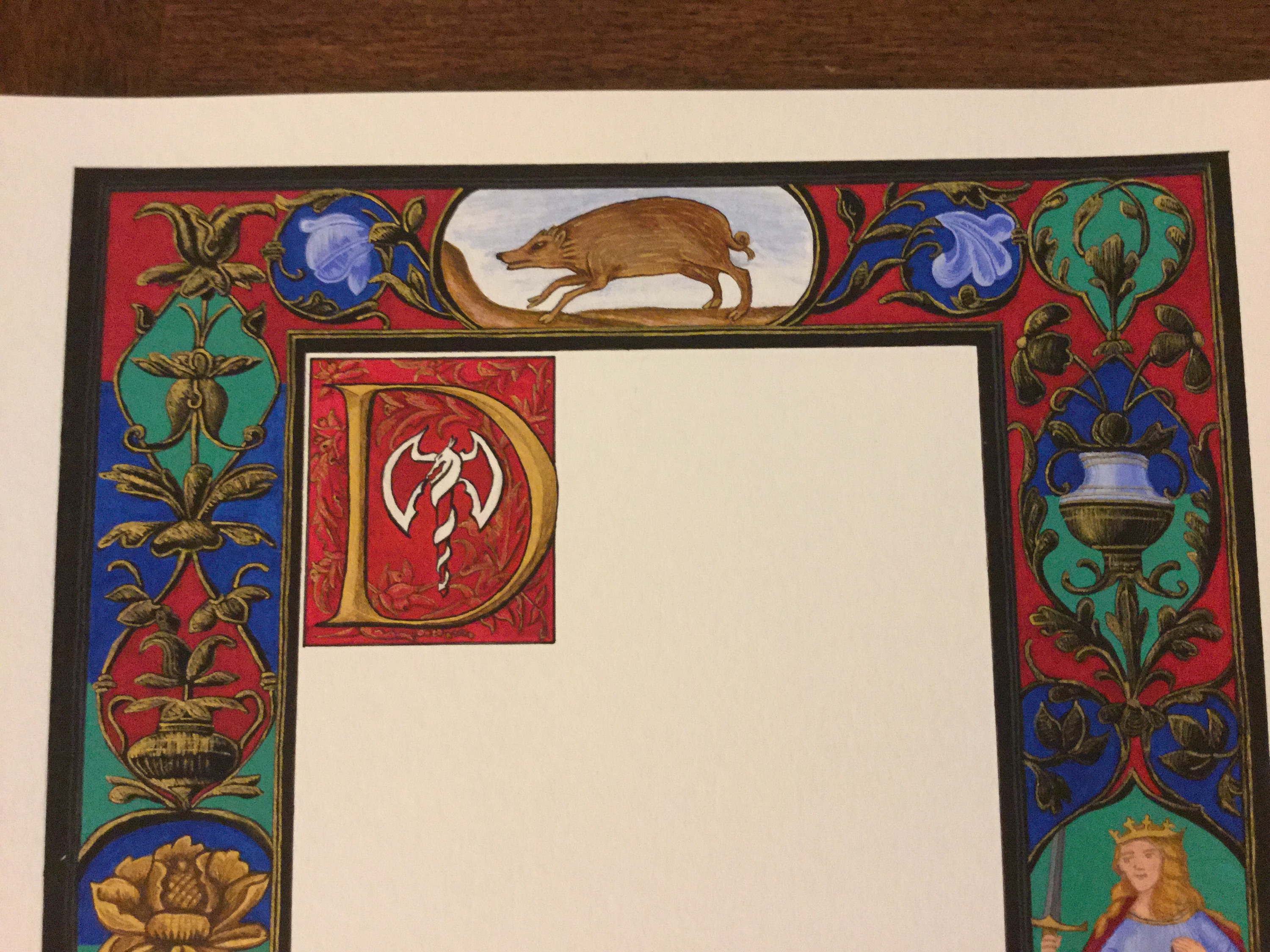 The completed rose:
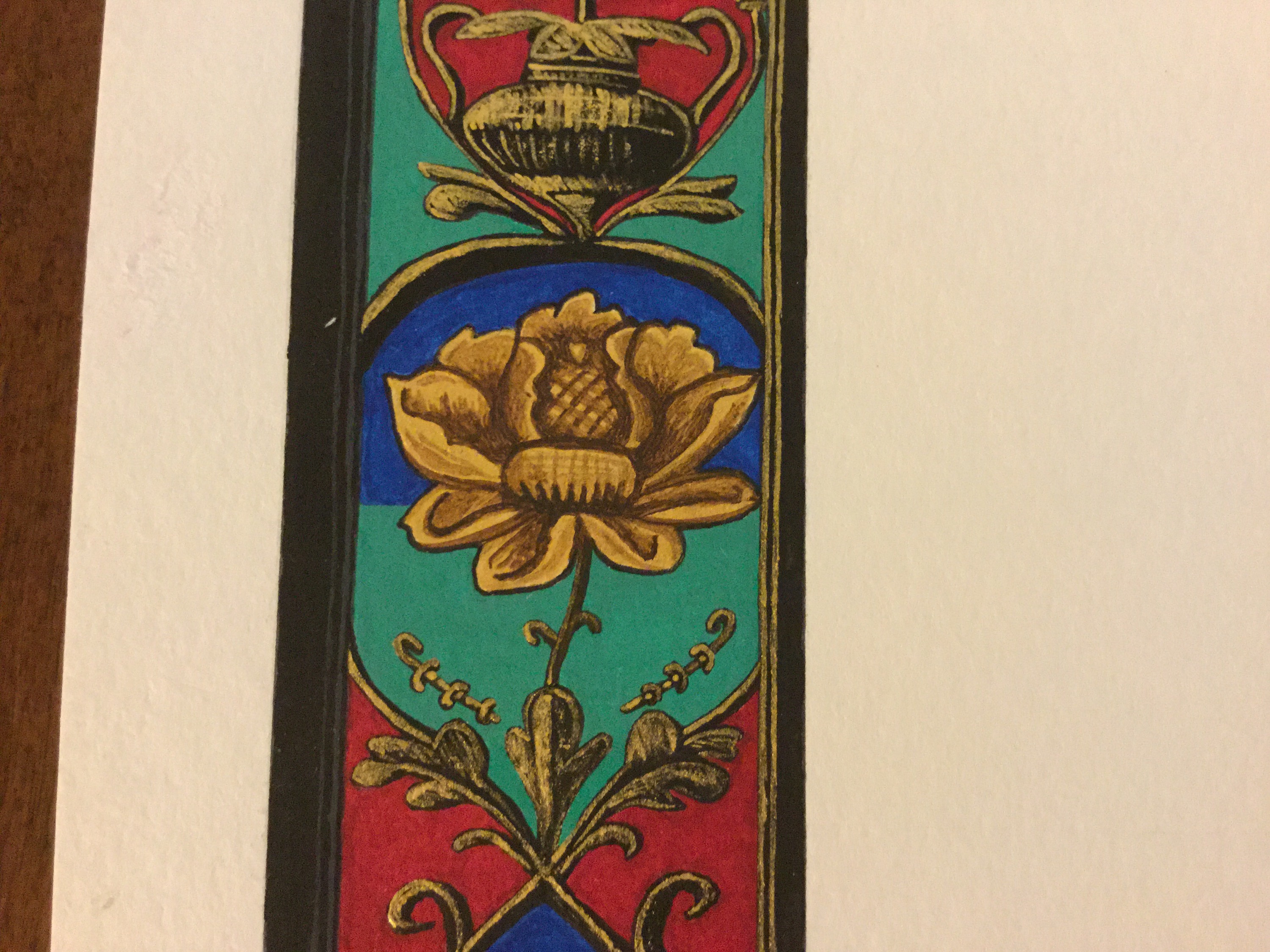 The completed bottom scene:
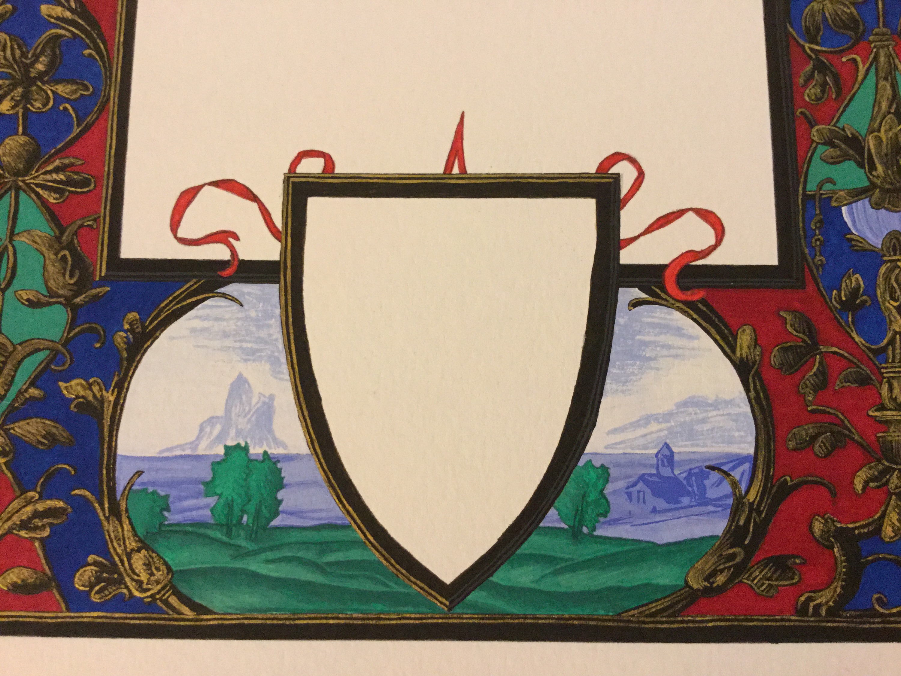 The completed right side:
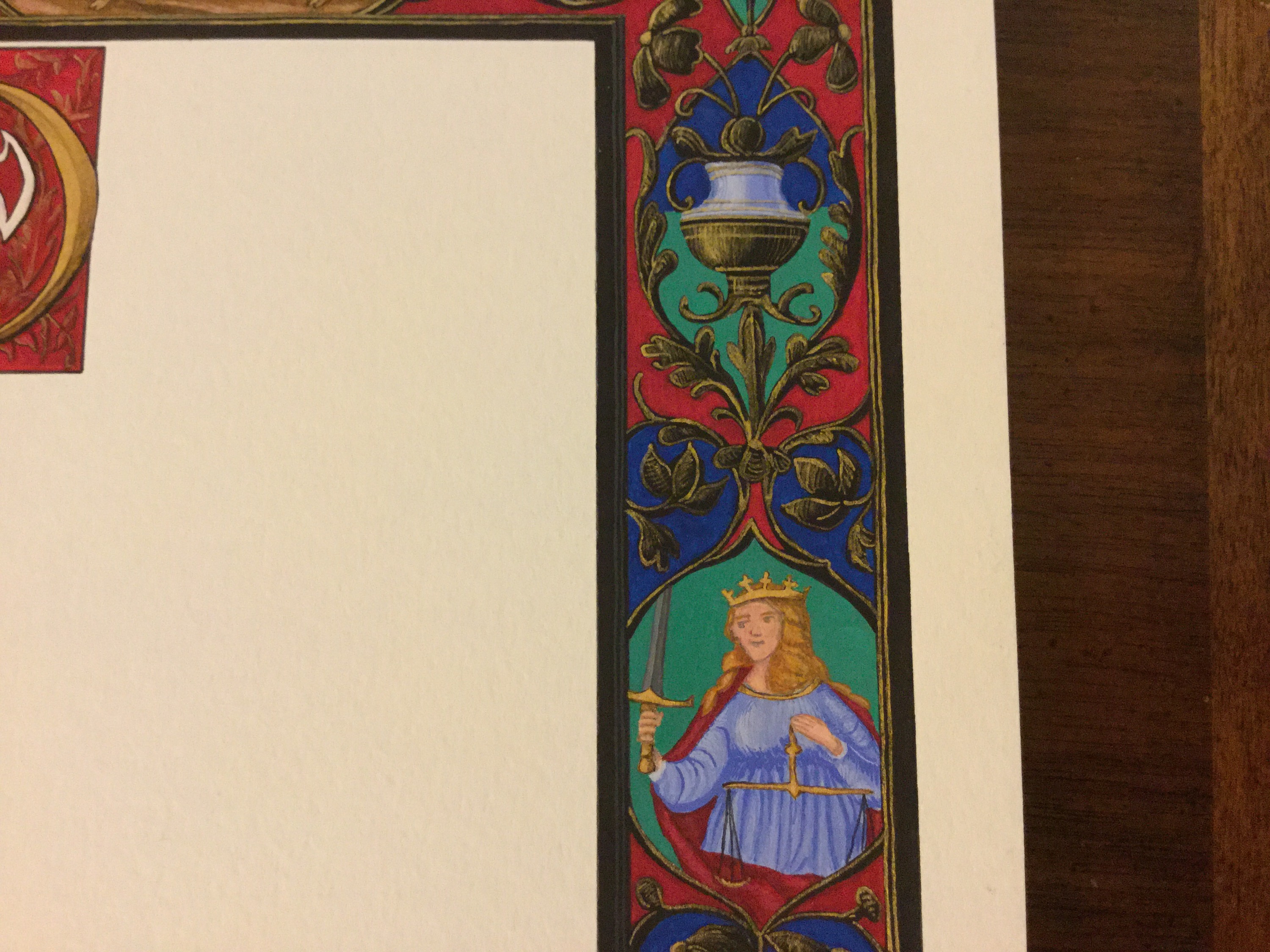 A final shot of the whole thing:
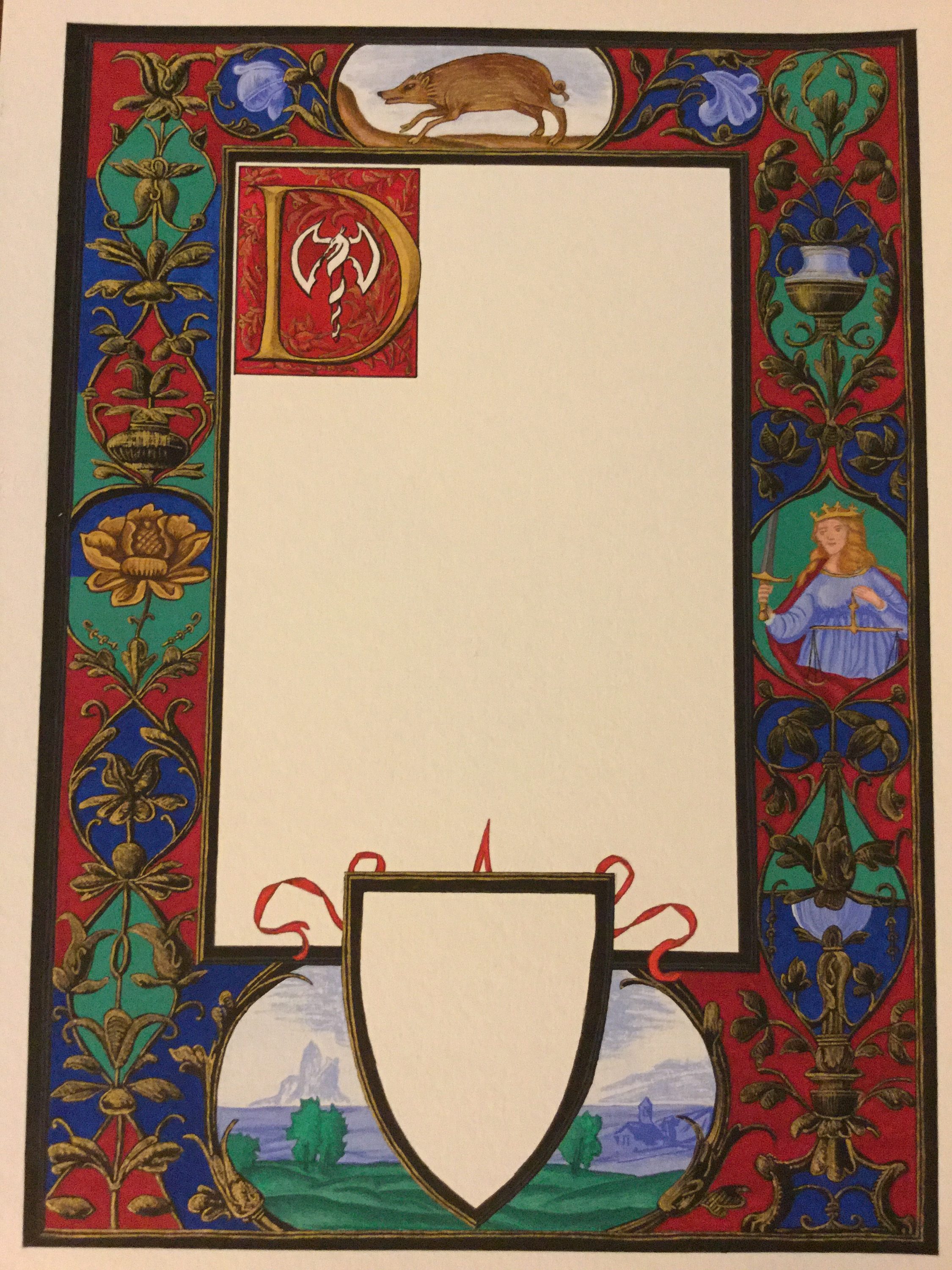 And again, but in different lighting. The nature of the gold means that one side shines more brightly than the other with the lighting I had.
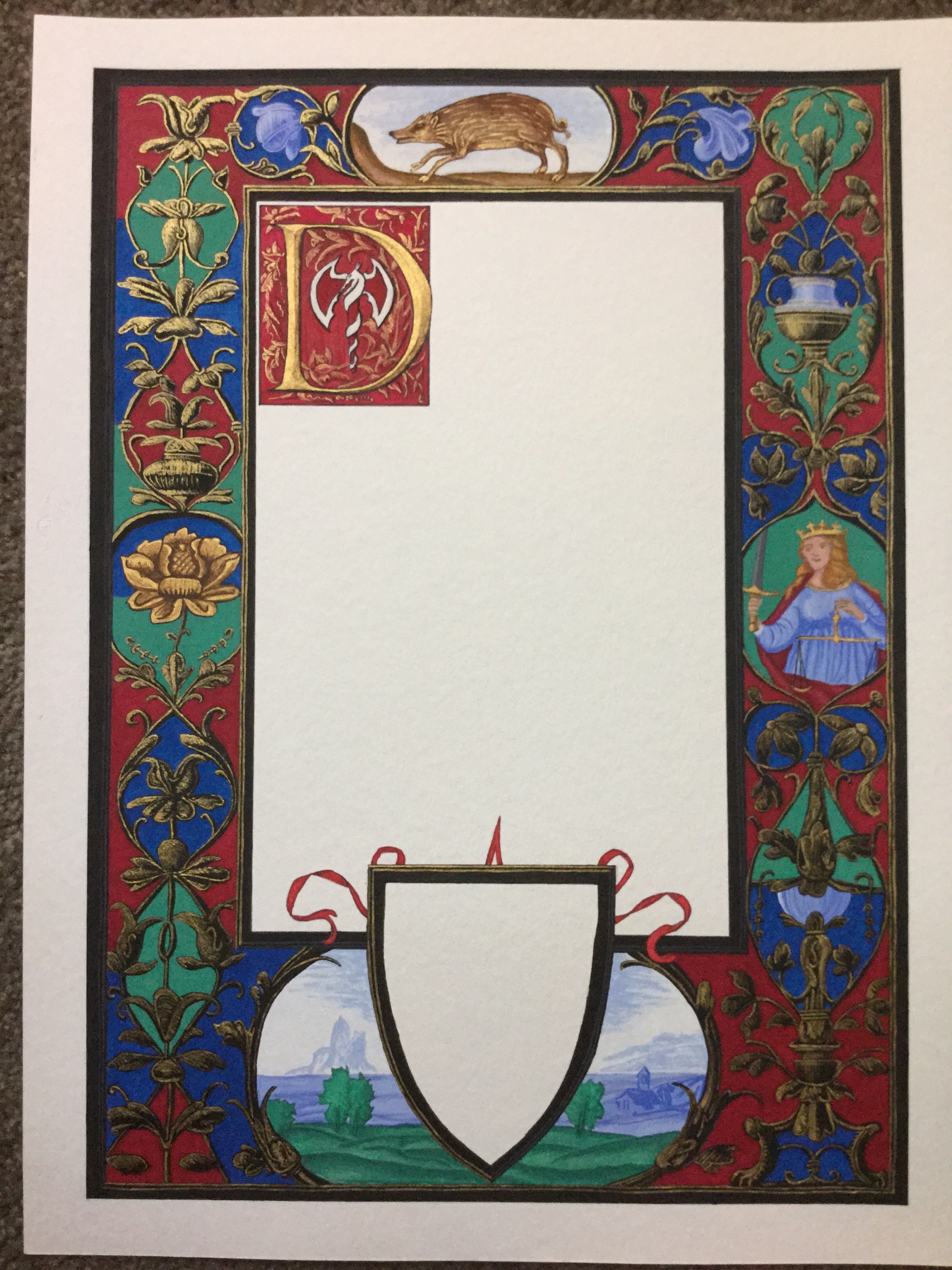 One more close-up of Lady Justice and the vase, showing her shaded cloak and scales.
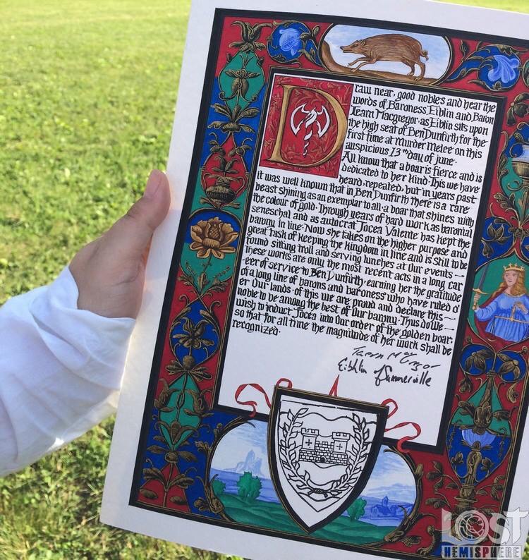
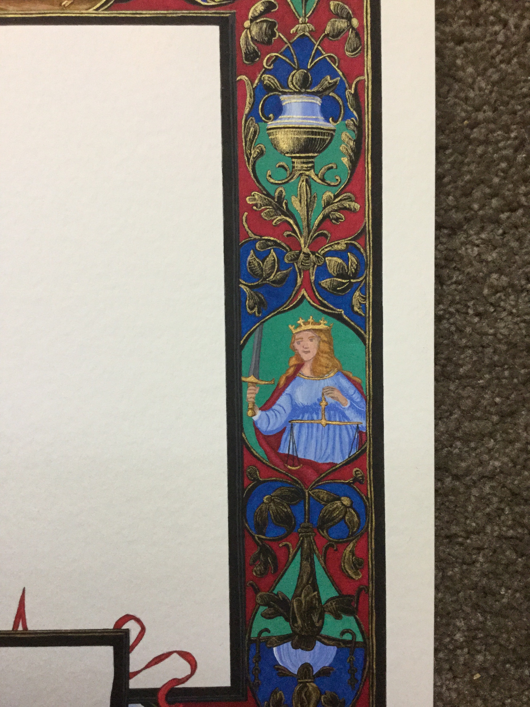 And finally, since I am not an experienced calligrapher, I passed this on to the requestor for calligraphy. I think she wanted to do it anyway. The baron was happy, the recipient was happy, and all was good (aside from that seal STILL not quite fitting).